Want to know the latest trends? Tune in on Trends Tuesday!
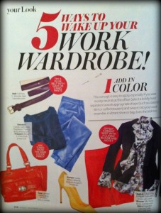
 One of our favorite sources for fashion trends is InStyle Magazine, and this month’s issue has a step-by-step dressing-for-work guide with a story called 5 Ways to Wake Up Your Work Wardrobe! We couldn’t help notice how similar these trends are to the very ones we are seeing in our work with our home furnishings and interior design clients, so today is the first of a 5-part series that explores how these concepts can add some pizazz to your closet as well as throughout your home.

Tip #1: Add in Color — The concept is easy to apply, especially if you wear mostly neutrals at the office: Select a boldly hued separate in a work-appropriate shape (such as a tailored skirt or cuffed trousers) and swap it into your usual ensemble. A vibrant shoe or bag does the trick too.
I think the words work-appropriate are key here. In the office, a little goes a long way. In addition to the examples in the article, here are a few colorful pieces that caught my eye while doing a little online browsing:
- J. Crew pencil skirt in fiesta purple
- Anthropologie turquoise peep toes and a similar, more affordable style from Aerosoles in purple
- French cuff shirt by JC Penny which comes in all kinds of fun colors including rumba red, panama rose, mystic purple and turquoise sea
- Flicker Melinda bag by Kate Spade comes in absolutely delicious colors — berry, dark spearmint and fire fly yellow
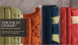
What are we seeing with color trends in home fashions? Check out this post by Drexel Heritage (Clairemont client), Arrested by Color, that talks about intoxicating reds, not-your-granny’s green and wild blue yonder to get an idea. And from what we saw in the Thomasville Furniture showroom (also a Clairemont client) at the spring and fall High Point Furniture Market, Thomasville already knows the secret behind mixing classic shapes with bright colors.
- Thomasville’s homepage shows classic sofa shapes in bright colors.
Need more color inspiration? Go to the Kate Spade website where you can shop by color for Kate’s holiday gift guide and check out this video from the Kate Spade blog called Give Colorfully.
I for one have always been a big fan of color and lots of it. The resurgence of bright colors makes me happy and makes me want to repaint my entire house. How about you? Tickled pink to see brights back in the spotlight? Or feeling blue that neutrals are taking a backseat?


While I was in meetings at NCSU’s College of Textiles yesterday, I learned that bright colors are usually more popular in a down economy. We need cheerful wardrobes to lift our spirits! Thought that was interesting.
I absolutely love this tip! It allows me to wear my old clothes but make them look new again with a little pop of color! 🙂